Overview

An iOS money management and education application geared towards people in their early 20s that makes money feel more approachable.  


Disciplines

UX/UI Design, UX Research, Branding, Motion Graphics, Data Visualization, Layout Design, Art Direction


Why Bright Wallet? 

Nearly 40% of college students have never taken a personal finance course or understand how to set themselves up for financial success. With the two of the sustainable development goals of the UN, good health and well being and quality education, Bright Wallet was created to provide an approachable money management experience and to ensure that anyone who needs the educational resources can access them.


Research 

The issue of lack of financial education became apparent when talking to several classmates and friends about just general money topics. After some research on the internet, I found that nearly 40% of college students and people in their early 20s do not understand personal financial management. This led me to create my own survey and I sent this out to students.

My results aligned with what I researched and the same percentage of students have never taken a money management course. I then asked them how comfortable and confident they felt about various topics.

Development  

Taking into account the different pain points people have and their wants when it comes to managing their money, I began with the creation of an empathy map. My goal was to truly understand how users may be feeling and what they are thinking before they use the application or what they might be thinking as they are using it.
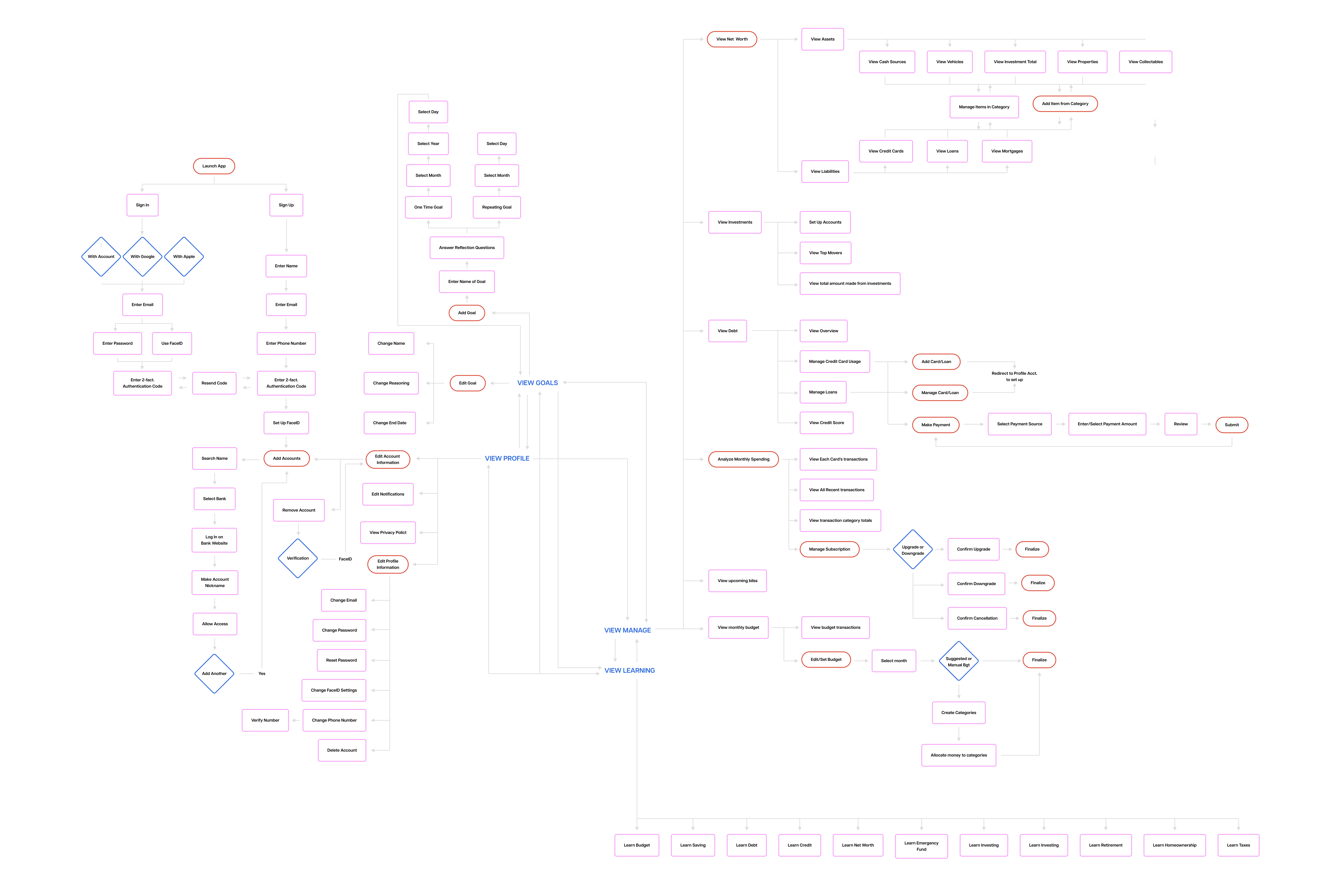
From here, I created a user flow. This changed multiple times throughout the development of the application from feedback and testing, however the purpose of my flow was to help me understand the organization of the application and where people would look for specific information when completing different tasks.


User Testing 

The rating of difficulty when completing most of the tasks in my application were relatively low. There were some that were given high scores, but this was because of issues with the prototype itself. I decided to tap into the ones that were ranked a bit higher than the others and ask myself what can I do to make this more efficient, accessible, and simple.

This is where changes to the overall interface and navigation changed, as well as the onboarding process. Although the onboarding was reported to be simple, there were areas that could have been broken up and safety features that were missing that would enhance the level of comfortability of using the application.

The Product 

The application is broken up into four sections, your overall financial overview, your monthly snapshot, financial goals, and education. Within the overview, a user can see their net worth, including their assets and liabilities, as well as an overview of their investment accounts and their debt, which includes any loans and credit cards. The monthly snapshot also has categories like monthly spending, upcoming bills, and a monthly budget.

Users can cancel subscriptions and make payments directly in the application, making it the perfect ‘one-stop-shop’ for anything related to money management. They can see where they are spending most of their money and adjust their budgets to match their lifestyle. The education section is broken up into different topics that provide information and resources to learn more.


Promotion  

Bright Wallet has several OOH posters and a billboard that can be seen in any urban areas and highways. There is also a 15 second commercial that is used as freemium streaming services and YouTube advertisements.

Bright Wallet Brand

The strategy with the creation of this brand was to make it feel friendly. Various shapes are used to create patterns and inviting imagery. This is paired with off white and simple layouts. Both of these elements combined make the product come across as straightforward yet unintimidating.


Let’s Chat 


© 2023 Emma Swayze